 Jack
Jack
Google introduced its design language, dubbed Material, in 2014 as a proposed solution to make its OS distinctive and replace the outdated Holo design language. The goal of Holo was to standardize the designs used across different versions of Android and make Android more uniform. Holo was a mostly dark look, with electric blue accents. While many loved Holo for what it was, it was definitely time Google stepped up its game in terms of design to keep up with Apple. In comes Material.
 |
| Material (left) vs Holo (right) settings apps |
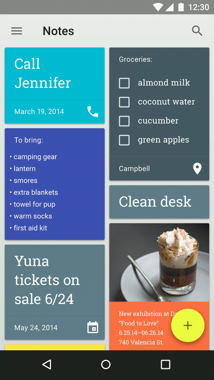
Good examples of Material Design are those that use the design language to create apps that follow the rules set across by Google, while also injecting a bit of originality and brand recognition. The best example of this I can think of is with the Tumblr app. It isn't a Google app, but it follows Material Design extremely well. It's not perfect, but it uses cards, distinctive animations, and depth to create an app that feels material, while also feeling like it's still Tumblr. Basically any app by Google has amazing Material Design as well.

A bad example of Material is Sleep as Android. It's a great app, don't get me wrong, but its adoption of material was half-assed, for lack of a better word. It doesn't do many of the things that Material apps should do. It feels like it's trying to give its users the impression of it being Material without putting in any of the work. It has a FAB, but its placement is off and tapping it is not animated. Actually, almost nothing in this app is animated better than the Holo days. The toggle switches aren't even animated! The UI is a weird combination of half-baked Material over a Holo base.

Material isn't just needed to make apps look better, it's needed to make Android look better. If apps do not follow this design language it fragments Android and makes it confusing to the user. Imagine if every app you open had a completely different layout and style. Different stylistic choices are great, but if you're making a modern Android app, please use Material in the way it's intended instead of half-assing it.
0 comments:
Post a Comment